

Meet the New KTR Logo: Where It Came From and What It Hides
KTR Crowns has a new look. How the old purple and black KTR logo became a teal smile, what we kept, what we changed, and the surprise hidden inside it.
By the KTR Crowns team · · 3 min read
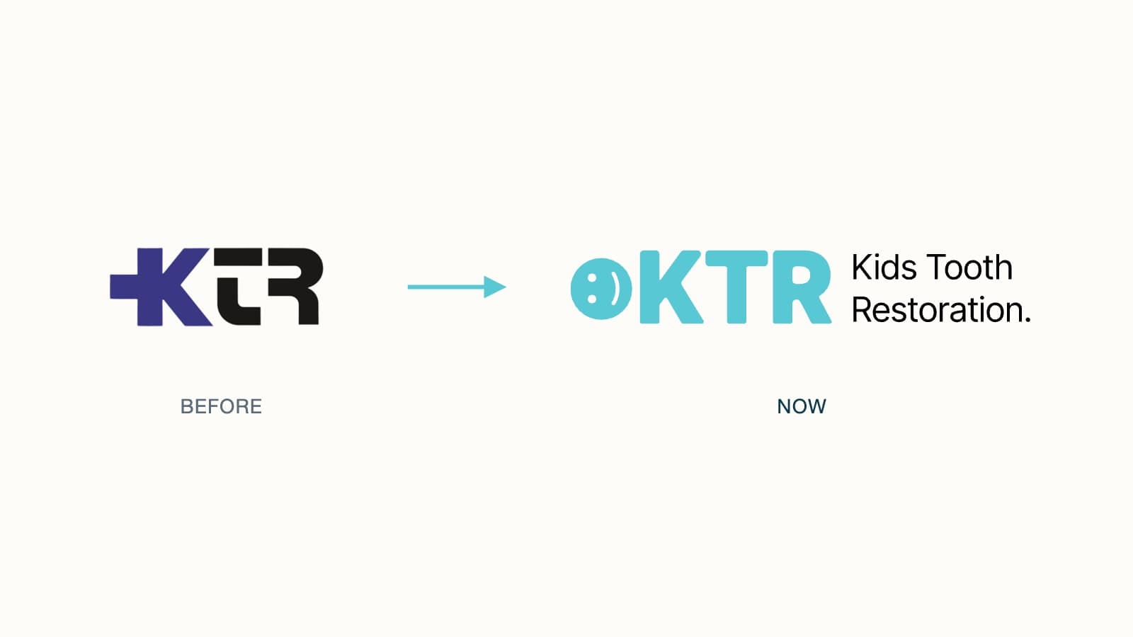
If you have visited ktrcrowns.com lately, you have probably noticed that things look different. We have a new logo, a new website and a fresh look across the brand. The crowns, the team and the way you order are exactly the same. Here is the story behind the new logo, and the small surprise we hid beside it.
Where we started
For years, KTR crowns shipped under a purple and black wordmark. Its signature was a bold plus sign fused to the front of the K, a nod to health care that made the three letters feel solid and serious.
It served us well, but it looked more like a hospital sign than a brand for children's smiles. The colors were dark, the letters were square cut, and nothing in the mark told you who the crowns were for. A dentist seeing it for the first time had to guess what KTR stood for.
What we kept, and what we changed
We did not want to throw the old logo away. The new one keeps its bones: the same three letters, in the same order, led by a symbol. Then we changed almost everything about how it feels.
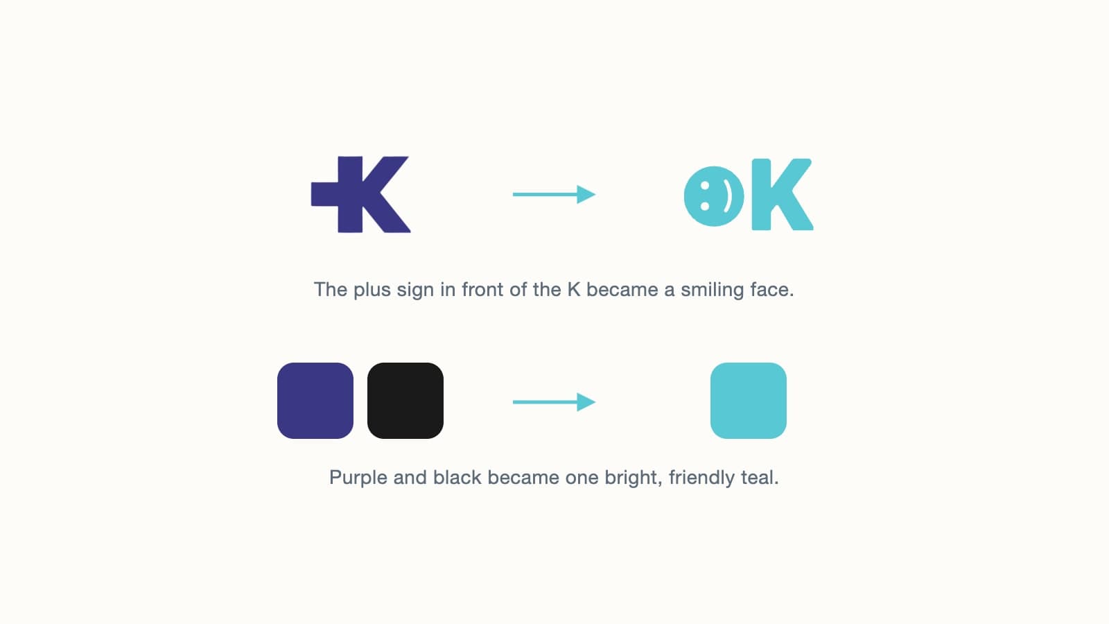
- The plus became a smile. The clinical cross is gone. In its place sits a solid teal circle with two dots for eyes and a gentle curve for a mouth, the reassuring smile we want every child to leave the chair with. That smiley, on its own, is our new logo mark.
- Purple and black became teal. One bright, friendly color replaces the dark two-tone scheme.
- Square letters became rounded. The new K, T and R are heavier and softer at the corners, so the wordmark reads as warm rather than stern.
- The name is spelled out. Kids Tooth Restoration now sits beside the letters, so nobody has to guess what KTR means.
Where the teal comes from
The new color was not picked from a swatch book. Many practices first knew our crowns through Pediatric Dental Resource (PDR), the online store where dentists ordered KTR crowns for years before it moved here to ktrcrowns.com. Its logo is a bright teal P:DR, and if you look closely, the colon and the curve of the D make a grin: a sideways :D tucked into the letters.
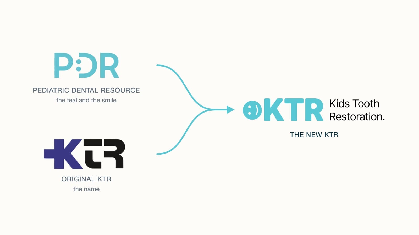
We borrowed that teal so the look dentists already recognize carries straight over to KTR. The grin came along too, with one change: instead of building it out of the letters, the new smiley gets a circle of its own, calmer and softer than PDR's wide open :D.
Now look at it sideways
The logo mark is just the smiley; the K is not part of it. But we set the two side by side on purpose, as a quirky nod to the childlike character at the heart of the brand. Take the smiley and the K beside it, and tilt your head to the left. The face sits upright on top, the long stroke of the K becomes a pair of outstretched arms, and the two diagonals become legs. It is a little stick figure, smiling back at you.
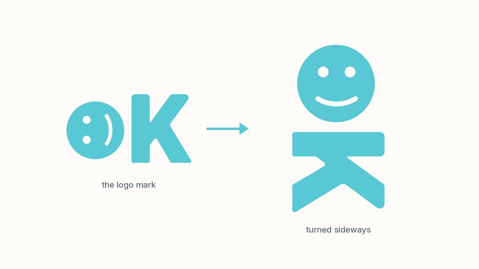
It is a small wink, but it sums up the whole idea: a happy kid with a healthy smile.
What has not changed
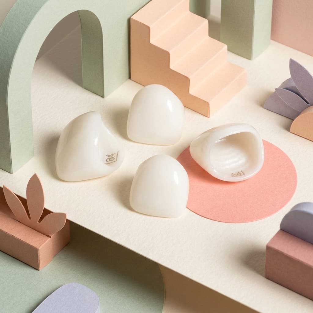
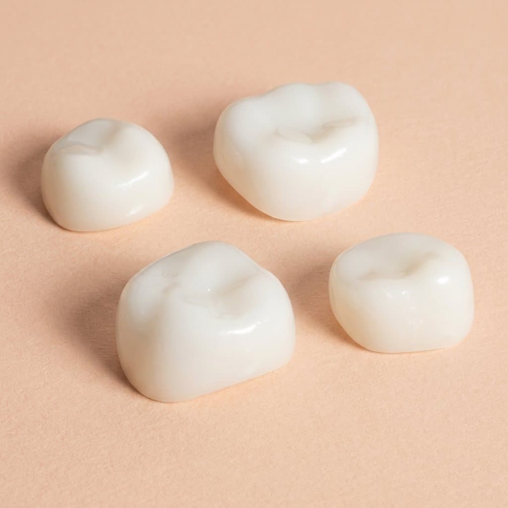
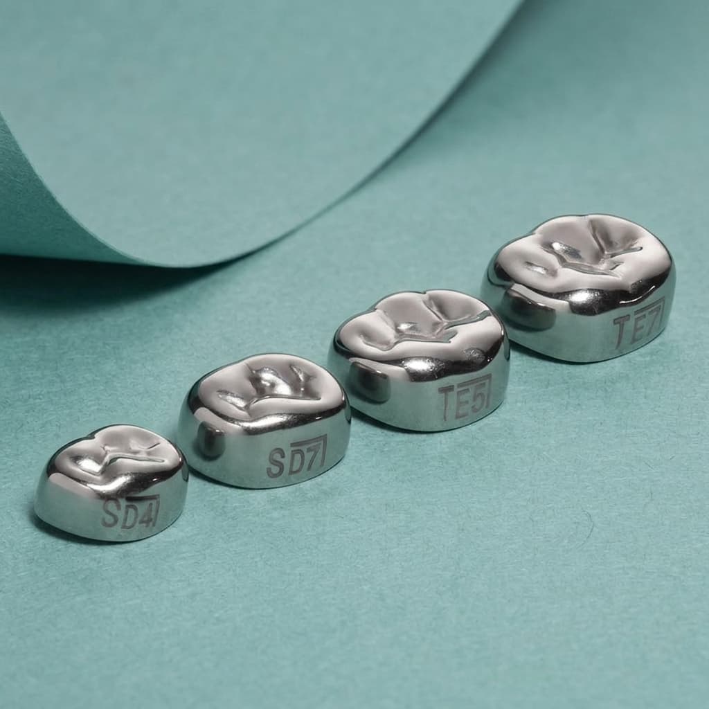
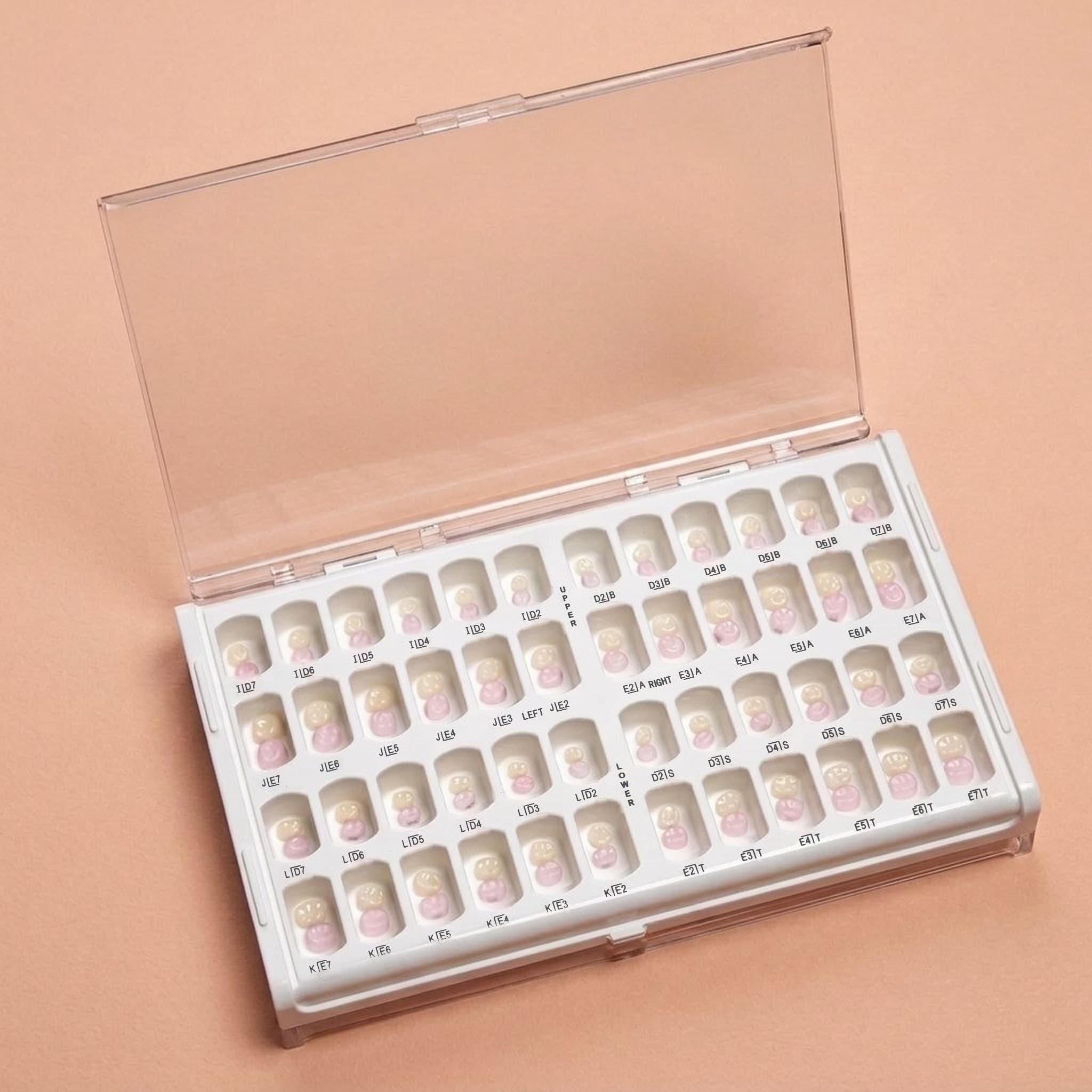
- The crowns. The same stainless steel and zirconia crowns, the same sizes and the same labeling.
- The people. The same team answers the phone at 1-800-506-5108 and the inbox at info@ktrcrowns.com.
Have a question about the change, or want to see the crowns in person? Get in touch or request a free sample.
Frequently asked questions
Did KTR crowns change with the new logo?
No. Only the logo and website are new. The stainless steel and zirconia crowns, sizes and labeling are the same.
How is the new KTR logo different from the old one?
It is a redesign of the original purple and black KTR logo. The three letters stay, the plus sign becomes a smiley face that now serves as the logo mark, and the colors change to the bright teal dentists know from Pediatric Dental Resource.
This article is general information for dental professionals. It does not replace clinical judgment, the product's instructions for use, or current AAPD guidance. Questions about a specific case? Call us at 1-800-506-5108.
Have a technique or case worth sharing?
We publish guest articles by pediatric dentists, residents and educators. Pitch an idea and write for colleagues.